A dental clinic has two audiences, and they want opposite things. The patient wants to forget where they are. The dentist, the assistant and the sterilisation nurse need to remember exactly where everything is, every time, under time pressure. Most clinical interiors pick a side. The ones that work refuse to choose.
Fidelity Dental Clinic on Sunset Road in Bali is a useful case study because the brief was constrained: reception, waiting, circulation, treatment and sterilisation areas all had to fit inside a limited footprint, while holding hygiene standards, patient privacy and an efficient workflow for the medical team. No extra floor area was going to appear. The design had to earn calm through organisation rather than through space.
What follows is the thinking behind that kind of project — the decisions that matter when you are planning a dental clinic, a medical suite or any small commercial interior where the public and the professional share the same walls.
Start with zoning, not finishes
The first drawing for a clinic should not be a moodboard. It should be a diagram of who goes where, and when.
In the Fidelity Dental Clinic project, the layout was resolved around five functional zones: reception, waiting, circulation, treatment and sterilisation. Each has a different tolerance for noise, for foot traffic, for being seen. Getting those zones into the right relationship before choosing a material is what makes the finished space feel effortless.
The reception is the first clinical signal
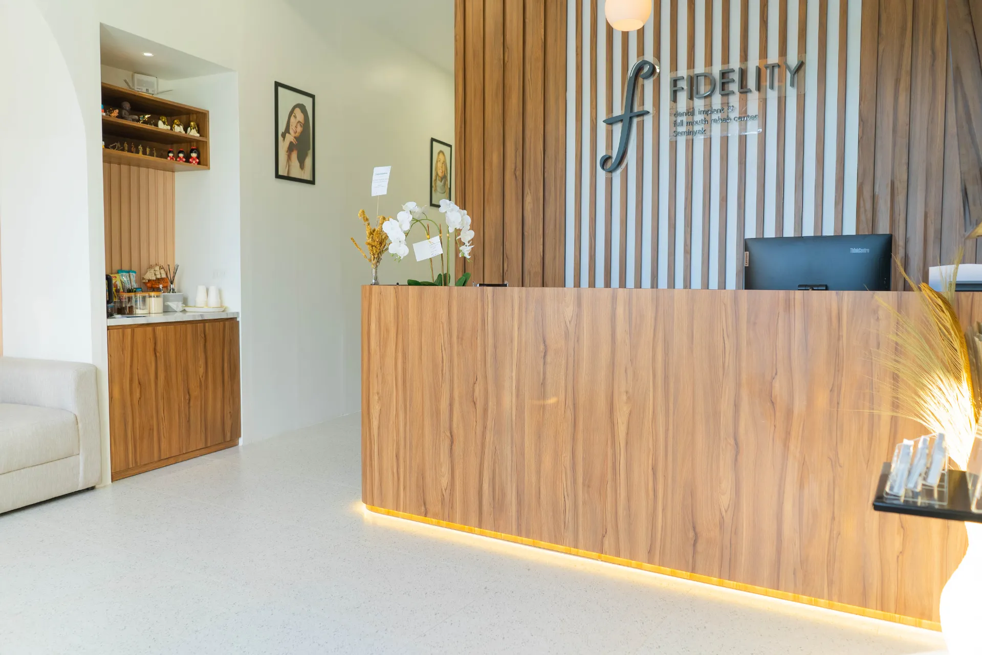
Patients read a room in the first few seconds, and they read it for competence as much as for comfort. A reception desk that looks improvised suggests a practice that improvises. A desk with a clear working surface, a place for the file, a place for the card machine and a screen the patient cannot read from the waiting chairs suggests the opposite.
This is where warm materials do the most work per square metre. Timber at the reception and in the waiting area softens the arrival without pretending the space is a hotel lobby. The clinic's palette — natural wood finishes and soft neutral colours — does not try to hide that it is a medical environment. It simply removes the parts of that environment that signal institutional indifference: the grey laminate, the fluorescent grid, the corridor that smells of disinfectant and nothing else.
Keep treatment areas private without making them feel hidden
Privacy in a clinic is not only about walls. It is about sightlines from the waiting area, the path a patient walks to the chair, and whether a conversation at the desk can be overheard by the next person in line. A layout that routes patients past other treatment rooms, or puts the reception phone within earshot of the waiting seats, undoes a great deal of good design.
The useful test is a walking test. Follow the patient's route from the front door to the chair, and the nurse's route from the chair to sterilisation. If either route crosses a zone it should not, the plan needs another pass — before finishes, before drawings, before anyone quotes a build.
Materials that read warm but survive cleaning
Warmth and hygiene are usually presented as a trade-off. In practice the trade-off is narrower than it looks: it is mostly about where you put the warm material, not whether you use it.
Timber where hands and eyes rest
Timber belongs at the reception desk, on the waiting-area wall, on the cabinetry fronts the patient sees, and on the ceiling if the height allows. It does not belong where it will be repeatedly wiped with clinical-grade disinfectant at close range, or where moisture sits. Specifying the right species and the right finish — and being honest about maintenance intervals — matters more than the visual sample in a showroom.
The same logic applies to upholstery in the waiting area: cleanability first, colour second, texture third. If you are weighing fitted joinery against loose furniture in these public zones, built-in cabinets versus freestanding furniture sets out how to choose between them by room and by maintenance load.
Curves instead of hard corners
Curved architectural details appear throughout the Fidelity project, and they are doing more than decoration. A rounded reception counter, an arched opening, a softened wall return — each removes a hard edge that reads as institutional and, in a clinic, is also a thing someone can walk into. Curves calm the eye and reduce the number of abrupt transitions a nervous patient has to process.
They also solve a planning problem. In a limited footprint, curves let circulation bend around a zone instead of stopping at it, which is often the difference between a corridor that feels tight and one that does not. The cost is in the craft: curves demand better joinery and better site coordination than square corners. That is a build conversation, not a sketch conversation, and it is worth having early with whoever is executing.
Daylight is part of the treatment
The clinic relies on abundant daylight, and that is a clinical decision as much as an aesthetic one. Daylight gives the eye somewhere to rest that is not a screen or an overhead fixture, and it makes a small room feel less like a room you are waiting in.
Where daylight is limited by the site, the substitute is layered artificial light rather than one bright ceiling grid: warmer task light at the desk, softer ambient light in the waiting area, and clinical light only where clinical work happens. Three circuits, three moods, one room. Soft lighting in the public zones is one of the cheapest ways to change how a practice feels, and one of the most commonly skipped.
Storage is clinical infrastructure
In a dental clinic, storage is not a convenience. Consumables, instruments, records and cleaning supplies need a home close to the point of use, and every item without one ends up on a surface that can no longer be cleaned properly.
Custom cabinetry was used across the project to maximise storage and support clinical operations — which in practice means drawers sized to what actually goes in them, bench heights set to the task, and fronts that close flush so the room reads calm even at the end of a busy day. Generic modular units rarely fit a clinical workflow well, because the workflow is not generic: it is a specific sequence of movements repeated hundreds of times a week.
If your project involves reworking an existing unit rather than building new, the storage question comes first, because it usually decides how much of the plan can stay. Renovation work starts with a condition assessment for exactly this reason: what you keep determines what you can change.
Design for the team, not only the patient
A clinic that photographs well and works badly is a failed project. The people who will judge this interior most harshly are the ones standing in it for eight hours.
Efficient movement between spaces was a stated goal of the Fidelity design, and it shows up in unglamorous places: the distance from the chair to the sterilisation area, whether a nurse has to cross the waiting room to restock, whether the receptionist can see the door and the diary at the same time. These are the details that determine whether the practice runs on schedule or runs late.
Test them by walking the route with the dentist and the assistant, not only the owner. Ask what they carry, how often, and where they put it down.
What a limited footprint forces you to decide
Tight sites are clarifying: with no spare room, every zone has to justify its area.
- Which functions can share a zone? Waiting and reception often can; sterilisation and treatment storage usually cannot.
- Where can a door be removed? An opening costs less space than a door and a swing, and reads more generously.
- What can be built into the wall? Recessed storage and joinery buy floor area back without moving a structural line.
- What has to be visible? A sterilisation area that is discreetly screened reads as care; one that is hidden entirely reads as a mystery.
None of these are finish decisions, and all of them change how the clinic feels. This is the argument for planning architecture and interior together rather than in sequence — the Architecture / Interior service exists precisely so that layout, materials and technical drawings are resolved as one package instead of being negotiated on site. There is a longer explanation of why that sequencing matters in planning architecture and interiors together.
What this looks like on a commercial brief
Clinics, spas, salons and hospitality spaces share a structural problem: they are commercial operations that have to feel personal. The Sang Tirta resort project is a useful parallel, because the same questions come up — guest circulation, privacy, material detailing for a tropical climate, and how much of the operation to put on display.
The difference is tolerance for compromise. A resort can absorb an awkward corner with planting and lighting; a treatment room cannot, because someone has to work in it. Clinical projects therefore benefit from a build partner used to coordinating joinery, MEP and finishing trades against a fixed plan — the Custom Interior & Build service covers that side, from drawings through to handover, with one project manager accountable for the sequence.
A short brief for your own clinic project
If you are about to plan a dental or medical interior, this is enough to start a productive first conversation:
- The patient journey, written as a sequence from street to chair, including where they wait and what they can see from there.
- The staff journey, written the same way, including restocking and sterilisation loops.
- A list of equipment with dimensions and service clearances — not a wishlist, an actual list.
- Cleaning protocols, so material choices are tested against what will actually be used on them.
- What must stay if you are renovating, and what you are willing to lose.
- Your priorities in order, because on a limited footprint something will have to give, and it is better to choose it than discover it.
Fidelity Dental Clinic is a good example of what happens when those questions are answered before the palette is chosen: a space that feels warm and contemporary, with timber, soft neutrals, curved forms and daylight doing the reassuring, while the zoning, cabinetry and circulation do the work. The clinic does not look like a hospital. It also does not look like it was designed by someone who has never sat in a dental chair.
If you are planning a clinic, a medical suite or a commercial interior in Bali and want the plan resolved before the finishes, get in touch with the ZEF Living team to talk through your site and your workflow.